Israel Shotridge (www.shotridgestudios.com) is one of Alaska's finest Tlingit carvers. His carvings and serigraphs are well known in and beyond the Native Art world.
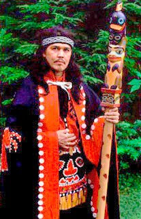
 Israel Shotridge in full Tlingit regalia
 Totem © Shotridge Studios
Shotridge's career started with totem poles and branched out into many other forms including serigraphs.
Serigraphs are the product of a unique and pain-staking printing process. Images are made on paper by forcing special inks through a fine mesh screen. Where no ink is wanted, a stencil mounted onto the screen blocks it. Functionally the process works the same way as silk-screen printing.
 Serigraphs Collection © Shotridge Studios
Left to right: Potlatch, Heron, Wolf , Orcas and Thunderbird
Screen printing started in China about 3,000 years ago and is still done the same way today...using machines instead of people when done on a commercial scale.
Traditional serigraphy involves the cutting of stencils with knives. Today they can be and often are made digitally, of course.
One stencil is made for each color.
How Colors Are Made
Colors are either primary, secondary or mixtures of them. Primary colors are irreducible. Orange is reducible to red and yellow. Yellow is reducible to green and red. But green and red are irreducible, making them primary colors (of light). There is a lot more about this subject in my book, Giclee Prepress - The Art of Giclee (which you can test drive at available at www.gicleeprepress.com) and in previous blogs.
Most colors are mixtures of other colors, just like shopping for house paints. A dab of this, a splash of that... each combination is totally unique. No other color will ever exactly match it. You learned that when you went back and got that extra quart you needed to finish painting the house. It didn't match exactly, eh?
In the serigraph and silk screen printing processes, colored inks are squeegee'd through stencils onto paper (tee shirts, or whatever) one color at a time. After each color is applied to the substrate the stencil is removed, a new one put on for the next ink color, and so on.
Registration between colors is the hard part. If one stencil moves even a little bit, it can ruin a fine piece of artwork or printing. However the process requires some degree of physical force to squeeze the ink through the stencils onto the substrate, and that stress can deform the stencils if not carefully controlled.
The difficulty of maintaining registration also limits the total number of colors that can be used.
New Technology = New Marketing Idea = New Product
Until now, Shotridge Studios released their serigraphs only as silk-screened prints on art paper. The prints have been popular for over a decade. Ordinarily you'd think that's great... but 'mature' markets are a challenge for sales aficionados like Sue Shotridge, Israel's wife who runs Shotridge Studios allowing Israel to do his thing (lucky him).
Sue Shotridge is one of those rare people who see the big picture.
Today's big picture is about delivering more for less. That much has been clear for some time and is the likely vision of our future together, but that's another story. For now, it's enough to think about how to add value to your printed art. What makes Sue especially clever (at least in our estimation) is that she totally clued in the possibilities that giclée offered to develop new limited editions of the serigraphs. After all, if Hollywood and the music industry re-sell 'digitally remastered' art, by golly, so can Native Artists, eh?
Giclée Adds More 'PDV'
Readers of this blog know how giclée has fundamentally altered the art world. Until giclée, art patrons had a choice of originals or prints. Art prints used to be – and still are in many cases – hand-made by lithographic or rotogravure printing.
As the industrial revolution produced faster and cheaper printing machines, the market migrated towards the lower priced prints... and still does. But I digress...
For the customer there used to be only two choices... an expensive original or a $50.00 poster. But not anymore...
Giclée changed all that by printing images of finer quality than any other printing process. That introduced a third level of quality, a middle range positioned between a traditional print and an original. Sue recognized that and decided to create a new product line... the Shotridge Giclée Collection.
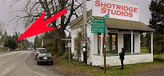
 Shotridge Studio's new showroom is housed in
Vashon Island's historic Fuller House at the crossroads of
Vashon Highway and Cemetery Road, catty-corner to the
Vashon Allied Arts Blue Heron Gallery hiding behind the
bush pointed out by arrow.
While the expanded range should make customers more happy, the Shotridges are happy too because with giclée they can print on demand, which eliminates their need for inventorying large quantities of large prints.
Sharp Eye for Detail
The smallest details are part of any big picture and Sue Shotridge catches them all. The differences between a serigraph and a digital reproduction of one made on our new 10-color Epson® 9900 are like the differences between a diamond and a Zirconium®... you need a loupe to see the difference.
The main difference is the sharpness of the lines of a serigraph or silk-screen print. Serigraph stencils are cut with blades. They are like the lines of a vector illustration.
Vector art has to be rasterized for giclée printing. Rasterization breaks down images into the pixels we have all come to know and love. That is done to make full color printing possible.
Without dots, a separate printing plate is needed for every color. Want to print a rainbow? That's a lot of printing plates.
Although rasterizing breaks-up otherwise sharp solid lines into a matrix of dots (which can result in 'jaggies' without sufficient resolution density), by using dots 'full color' can be made from as few as four ink colors -- cyan, magenta, yellow and black (CMYK).
All Colors Are Not Created Equal
 The four-color printing process cannot produce all colors.
 For color-critical material like logos, spot colors are used.
The logo graphic is put on a fifth printing plate (or a sixth, etc)
for a precise ink color, usually selected from a standard
color reference like the Pantone® swatch book shown above.
The fact that the four 'process colors' (CMYK) are simulating other colors is an important distinction. It means that process colors cannot exactly match the kind of spot colors used in serigraphy or any other screen printing process. That is why there are spot colors in the first place... because the four-color process can't do the job... it is physically impossible.
The question is...
How Close Can You Get?
Being in the fine arts printing business, the reputation of Vashon Island Imaging (www.vashonislandimaging.com) rises and falls with our color accuracy. Our slogan is 'best color in town'. That's why we just installed Epson®'s new 10-color printing technology. It prints more colors than any other printing process. That's a tall claim, eh? (Makes it good for tall orders.)
Want Proof?
Proof of giclée's claim to best color is found by virtue of the implementation of Epson® 10-color technology as a proofing system for nearly all other printing machines in the world.
The 'Proofing' version of the Epson® 9900 has a sophisticated (expensive) Fiery® RIP that can mimic most other printers. Here's how it works:
Say you want to print a million copies of something. You need a big printing press. There probably isn't one of those near your studio, and you may not speak any foreign languages. How can you be sure the color will be right?
A million of anything is a lot, but if it is unusable the same amount can seem like more. You can prepress to your heart's content but at some point you've got to see something, otherwise you are flying blind.
Hold that thought...
...Meanwhile, lets say that in the whole wide world there are 1000 colors and the picture you are printing is a rainbow that contains 999 of them. Anything less than 999 cannot be a faithful representation of the colors in the original rainbow, eh?
Here's the rub: no printing machine can do that.
More Colors = More Better
Continuing in 1000-color mode...
Printer A can print 700
Printer B can print 800
Printer C can print 900.
Printer C can be used to simulate the colors output by printer A or B, but not vice versa. Ergo, since the color gamut of Epson® 10-color technology is wider than any other printing process, it can be used to mimic any of them.
Translated, it also means the gammas of all the world's primary printing processes are smaller than the gamut of Epson® 10-color printing machines.
So the capability is there, the question is, do you have the prepress skills to control the machine and output pixel-perfect printing?
Ferrari® cars offer a comparison. The car can do anything but how it performs is limited by the skills of its driver. So it goes with giclée printing.
Go With the Flow
In the end there are only three things that will affect the colors in the giclées you print:
- Ink
- Media
- Light
The colors of ink, media and display light are fixed points like the points of a triangle. You can rearrange them, but whatever you select is fixed. Fixed within them are the white point, neutral point, black point and any 'tint' that will affect all other colors.
The ink flow rate is not fixed, however. Thus everything you do in your prepress work is done to control the flow of ink(s) to create pixels of specific colors, with digital accuracy.
PhotoShop® provides enough controls to give you the accuracy you need but there are so many that it can be as confusing as the cockpit of an airplane.
So what do you do in a color match situation like the Shotridge serigraph collection?
Overcoming Optical Illusions
Begin by reducing the variables. Look at and compare single colors at a time. Test them that way, too. Soon you will discover that simply moving one way or another is making things worse. As one color gets better the other gets worse, or at least different. Even if one of the colors remains the same, it will appear different as the other changes.
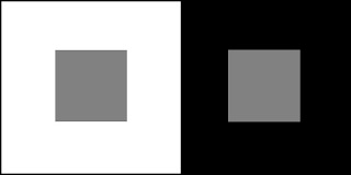
 The gray box illusion demonstrates the interrelationship of tones.
 Although the gray is the same, it doesn't look that way.
Co-dependence is tangible in the case of color. Changing one color in a group has an effect on how all others are perceived. It may not be a physical fact, but the optical illusion is real enough. The effect of co-dependency is heightened as colors approach opposition. Colors that oppose each other are also called complementary colors.
Complementary colors cancel each other out. Add them together in equal parts and you get a neutral shade of gray. (Noise-canceling audio headphones work the same way with sound waves.)
It is difficult to look at the borderline between areas of complementary (or primary) colors. The rods and cones in our eyes cannot cope with extreme differentiation because the cells are vibrating on a microscopic level. The cells along the border rapidly shift between the colors on both sides. The more divergent the colors, the more the borders will 'vibrate'. It is also what makes colors fight with one another.
These particular colors are part of the Native 'brand' and are thus 'holy'.
Teal is a shade of cyan. Red and cyan are opposites... they complement one another.
Did our ancestors know that?
Teal is a shade of cyan. Red and cyan are opposites... they complement one another.
Did our ancestors know that?
So you can see that trying to match colors is problematic at best. If changing one color affects all others, the permutation of possibility gets astronomical fast as you add more and more colors.
Two other factors make matters worse. Colors appear differently according to the light they are perceived in and different people have different degrees of color 'blindness'.
Each of us sees some colors better than others and has favorites. These physical and psychological factors preclude the possibility of our every knowing whether any two people see exactly the same colors as someone else. That's why we compare things to certain standards of measurement, like Pantone® color system.
In digital imaging, every one of several million colors has an identifying number by which other digital devices can recreate them faithfully if proper color management has been followed throughout the chain of communication.
Using those standards, and a few other tools, we can control colors with the incredible accuracy needed for color-match work.
Reduce the Variables
Unlike you who print giclées, your client is usually clueless about most of these issues and challenges. Worse, clients mostly think that with PhotoShop® you can do anything. Well, in this case it turns out that they are right... You can achieve pixel perfect printing. (Hint: read my book.)
Here's how I approach color match at Vashon Island Imaging:
Process of Elimination
The key is to eliminate variables as fast as you can so that you can deal with one color at a time. Before you can do that you must get a sense of what your client thinks is right. It doesn't matter what you think of the colors... it matters what the client thinks about them. That is where the problems start.
One of the biggest challenges is communications -- talking about color. In the printing business we talk color day and night. We know how to talk about color. Most others don't know how because they lack the vocabulary. Did you ever try to describe a flavor? ...That's what I mean.
Speaking of Color
Begin with a client consultation. To solve the communications problem and get past the need for color-language skills, provide some test prints to form the basis of your discussion. Ask the client to tell you what is right and wrong with each color.
Use the client's opinions to make your first set of color corrections. Provide an odd number of new tests, each of the same image but with different combinations of (changed) colors. Again, ask the client what is right and wrong with each color.
Look at a picture in PhotoShop® and to see an example of what I mean use Image / Adjustments / Variations. You'll see a variety of looks with hue differences. When you select one, you see more variations of just that... tints, contrasts, etc. That process of selection is what we are emulating in our printing tests.
Whatever direction your color correction takes for one change, take another in the opposite direction. For example if one change involves magenta, the other should involve green. Work in pairs. The same applies to brightness and contrast. Working in opposites helps everyone narrow things down because sometimes it is easier to see what something shouldn't be rather than what it should be.
Solitary Confinement
The goal is to get the colors right one at a time... so deal with them one at a time. As soon as Sue agreed on a shade of red, only the teal would change in the next tests.
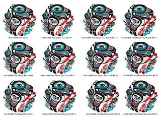
By confining the choices to one solitary color, the effect of color co-dependence spoken of earlier becomes instantly apparent. In the above grouping the red is the same throughout although it appears to be as different as the 12 hues of teal are.
The only way to get a semblance of control over the optical illusion of color co-dependence is to change only one color at a time. Then apply only one kind of color change at a time.
In the case 'Shotridge teal', Sue thought it wasn't blue enough and that it lacked 'ooomph'. Being an ex-New Yorker, I understand what 'ooomph' implies. Translated into giclée terms it means more Saturation and Contrast (another inter-related pair of variables).
The next test (shown above) has 12 changes of blue. The top row has 22 points of blue added to the Mid tones. The middle row has 22 points of blue added to the Highlights. In the bottom row the blue was added to the dark tones ('Shadows'). Then, to the right of each row there are 11 and 22 point variations of Brightness.
The purpose of this test is to determine if blue is the needed change and if so how much. In a perfect world you will find the final combo in a grid of 3, 6, 9 or at the most 12 choices. More choices than that becomes overwhelming and the brain will shut down.
Don't be surprised if you have to go back to the previously approved color and change that again. It is usually a result of color co-dependence revealing as much about the unchanged color as the changed one.
 The Potlatch color test series for Shotridge Studios included
a final round using the selected Teal with 5 different shades of Red.
All tests were done on two types of heavy-weight fine arts paper, both made by Epson®.
- Hot Press Bright White
- Hot Press Natural White
Both of these are fabulous papers for giclée, offering a good black. They have the dmax of Enhanced Matte with the look and feel of nice art papers like Hahnemuhle® and Arches®. It's the best of both worlds... with none of the 'curl' problems you encounter with some Hahnemuhle papers.
We try to stay with Epson® papers because they are made to work with their inks. That keeps the gamut as wide as it can be... and as noted earlier, more colors is ‘more’ better.
Sequence for Testing
To summarize, the testing sequence for each color is as follows.
1.) Hue
2.) Color
3.) Brightness
4.) Levels
5.) Saturation (seldom used as it shifts color)
Each of those variables should be tested in pairs of opposites aiming towards control of a solitary color.
Impossible Dream
To keep yourself sane and your client happy it is important for everyone concerned to remember two things:
- True color match is virtually impossible
- True color match is very expensive.
Using the testing sequence just described will get you through color match to the 99th percentile in the fastest way, using the least testing materials.
Another way of looking at it is this: If you had to struggle so hard to tweak the color, will your viewers see the difference? Don't scoff. That is a legitimate question. There are a couple of answers:
While the 12-part test shown above was drying, a few other artists came to the studio. Each asked what it was and when I explained it was a color test each did a double take, looked harder and said... 'oh yeah, now I see it'.
The flip side of that is 'Madison Avenue' research that proves without question that slight variations in a color will have an impact on sales.
Sales... that's Sue's territory and she'll be the first to say that their red and teal colors have an impact on Shotridge sales. That's why I listen carefully to what she says. I know that her sales equal my sales... and that's the kind of color co-dependence I like... The kind involving the color of money. That's what I call 'spot-on color'.


Recycled Paper Printing can also be used in order to overcome the difficulties as paper is manufactured from the bamboo plant and hence the plant has to be cut off.
ReplyDeleteGreen Printing